This guide is unreadable
A bad practice guide to digital accessibility

Want to build a webpage that blind or visually impaired users can't engage with?
Or create a story with a structure that's impossible to navigate, especially for screen readers?
How about colour combinations that can't be seen by colour blind users?
We've got you covered! Here's our handy guide to ensuring inaccessibility in your digital content production! (And importantly, how to fix it so that your content is easily accessible to everyone).
Alt text? Say no more

A picture is worth a thousand words. Check out this beauty:
The empty picture above is essentially how an image appears to blind or visually impaired users if there's no alternative text added to it.
How to fix this:
For simple images such as a photograph or graphic, you must provide a text alternative using ‘alt’ text. It helps screen-reading tools describe images to visually impaired readers and allows search engines to better crawl and rank your website. It also displays on the page if the image fails to load, as in this example of a missing image.
When writing alt text, consider:
1. What is the image saying? What is its function or purpose on the page?
2. Does the image have any embedded text? Such as a slogan or a logo
3. Does the surrounding content provide context? Is the subject of the image described?
Find out more about text alternatives for images.
Top tips for ALT text
Alternative "alt" text can improve accessibility. But sometimes when used out of context, alt text can cause confusion.
Alt Text is read by screen readers and other assistive technologies to provide information about the image's purpose to the reader. Alt text should not just describe what the image contains, but instead should provide context on how the image relates to the page content.
You should not use alt text for images that are purely decorative or don't convey any information.
Decorative images
A webpage or news story about engineering wind turbines, may contain an image of the main entrance to the university. In this case adding alt text generally describing the image does not add value when read out by screen readers. Instead of inserting alt text describing the university, you can leave the alt text empty. Find out more about decorative images.
Images that are part of a link
If an image is part of a link, the alt text should describe what the link does (e.g. contact person “x”) not just what the image shows. For example, if an image of staff is part of a 'contact' link, the alt text could be empty, because the link text indicates what the image represents.
Hyperlinks. Who needs context?

Finding out how to create digital content accessibly couldn't be simpler. Just click here, here, here, here or here.
Why does this matter? Because users who want to choose from this list of links won’t be able differentiate them from one another.
How to fix this: Link text that is as meaningful as possible will aid users in navigating lists of links, especially those using technology like screen readers.
The link text you use should clearly indicate where the link goes to or what will happen if when you click it, without needing context. Link text must not be vague e.g. click here and must never include the web address.
Every time you add a link to a page, imagine each link was on its own and had no text before or after. Ask yourself, would you know where that link would take you?
Find out more about writing descriptive links.
Love colours? Go big, or go home

Colour looks great on the catwalk but it should never be used at the expense of clear, inclusive communication. Careless application of colour can be overwhelming and confusing at best, at worst it can exclude entire segments of your audience.
How to fix this: Always think inclusively when applying colour and ensure a high contrast between your text and its background. Be cautious of colours with a similar hue – they may appear legible on your bright monitor but they can look darker in print, with reduced contrast. This could prove inaccessible to anyone with impaired vision or colour clarity.
When you use colour effectively, it can:
1. Draw the reader's eye to important information quickly and help them navigate the page.
2. Reinforce a sense of brand (Always choose colours from Imperial's official brand palette to keep your comms looking consistent and professional).
3. Complement accompanying photography.
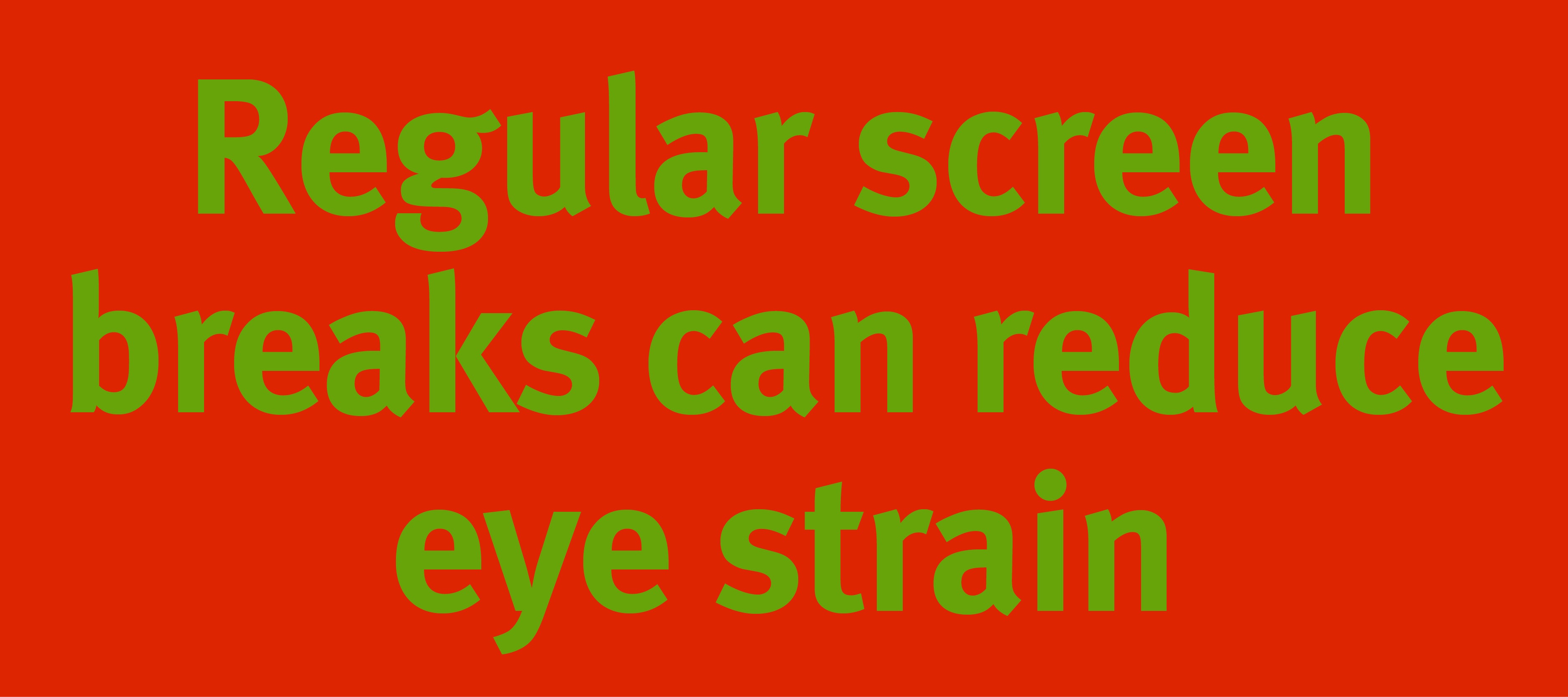
Always think inclusively when applying colour and ensure a high contrast between your text and its background. Be cautious of colours with a similar hue – they may appear legible to you (like the yellow and red in the image below) but can prove inaccessible to anyone with impaired vision or colour clarity. Also remember that colours can appear brighter on your monitor than they do in print, so go for the highest contrast possible and do a print test if you want to be sure.
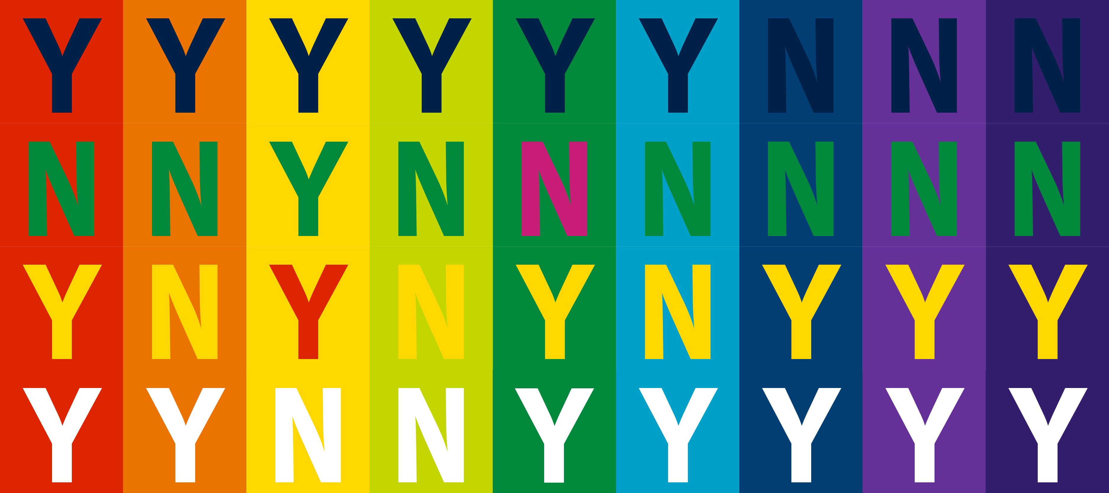
Yes or No... an example of Imperial RGB/digital colour pairings that do or don't work for AA accessibility on large text (14pt bold/18pt normal or larger).
Yes or No... an example of Imperial RGB/digital colour pairings that do or don't work for AA accessibility on large text (14pt bold/18pt normal or larger).
The chart above pairs random RGB colours from the Imperial palette to show which contrast well for legibility (Y) and which do not (N) on large text. Some of the colours that work here will not give good contrast at a smaller text size, so it's always safest to use black or white text when using a colour background.
Be aware that some readers will experience discomfort from viewing large areas of very bright colour on screen – this also includes backgrounds that are mainly white.
It is good practice to always use online tools to check colour contrast when designing. Our brand pages include the HEX codes for each colour in our palette.
And if you've ever wondered why the colours in your document always print darker than they appear onscreen, then here's an excellent explainer of additive and subtractive colour models.
Text over media: the flatter the better

What's wrong with this social media post? EVERYTHING. It breaks every accessibility rule – not to mention Imperial’s brand guidelines.
How to fix this: Think about the function of your content. Images should be used to catch the eye and instantly communicate on an emotional level. Text should provide practical information that is easy to read and accessible to all – including those who receive information digitally via screen readers and assistive technologies.
Where possible, text should be typed as HTML (e.g. written as social media post or typed within the main framework of T4) and your image should be used only as a supporting device.
Here are the benefits of using live text rendered as part of the HTML:
1. Your message can be read by assistive technology and will be indexed by search engines for wider reach. An image containing text that has been saved as a JPEG or PNG is effectively now just a flat image. Your mouse cannot highlight the text and the CMS will assume this content is just a picture.
2. Text will move responsively according to the device your reader is using, and text size can be scaled up by the reader if preferred. A JPEG with text on will encounter the same restrictions as a regular image, making things difficult for sighted to readers too.
3. Hyperlinks can be accessed immediately. No one is going to look at the awkwardly long url on your advert and type it into their browser, and it saves the need for QR codes, which don’t always scan well from screens.
4. The quality of your text will remain crisp and clear. Since JPEG files are pixel-based – composed of tiny dots just like a photograph – you are immediately compromising the quality of your text when you incorporate it into an image.
Ensure text is displayed as live text wherever possible and use the image as a supporting advice to draw attention.
Ensure text is displayed as live text wherever possible and use the image as a supporting advice to draw attention.
If it’s absolutely necessary to combine imagery and text:
1. Keep text to an absolute minimum and be sure to use alt text if you can.
2. Limit your usage of all-caps: besides looking aggressive, it can be very hard to read. If your headline is capitalised, keep it short. If not, then use bold weight for emphasis. Think how impractical motorway signs would be if everything was uppercase.
3. Ensure there is high contrast between the text colour and background colour (avoid using a ‘busy’ image with heavy detail and a lot of colour).
4. Remember that some email browsers automatically hide images. Use email image headers for decoration only and ensure all important information is repeated in the body of the email. Ask yourself if your message will still make sense if no images can be seen.
On a digital screen, adding the text to your image is the only option. These slides are only displayed for 10 seconds, so always keep text concise and ensure a clear hierarchy of information.
On a digital screen, adding the text to your image is the only option. These slides are only displayed for 10 seconds, so always keep text concise and ensure a clear hierarchy of information.
Who needs headings?

<H1>
<H2>
<H3>
<H4>
It's so boring following a pattern. How about:
<H1>
<H3>
<H4>
<H2>
Much more interesting, right? Well, maybe, but unfortunately it's confusing for users, algorithms and assistive technologies.
Headings enable sighted users to scan a page, to find and understand information quickly. When used in HTML, they take on larger significance – more than simply changing the appearance of your content, they are essential for blind and visually impaired users to access the information they need. Incorrect headings on your webpage are as useful as a jumbled recipe or a printed catalogue with no index.
Headings also provide vital structure to your work. This benefits all users, as well as visually impaired or neurodivergent users.
How to fix this: Use headings to organise and structure your content for accessibility, as this enables screen readers and assistive technologies to navigate your web page. Headings will structure your content by organising information into different parts – this will improve user experience and boost your page ranking in web searches Search engine optimisation (SEO).
With content management systems (CMS) like T4 used at Imperial, it’s easy to use the correct heading without any knowledge of coding. Here’s a headers and hierachy 101:
1. Coding for headers <h1> to <h5> is managed by T4. These are hierarchical and are logical. The image below demonstrates how headers can be applied.
2. Your main headline should use an <h1> header and this should be the only <h1> header on your page. T4 will automatically provide an <h1> tag in HTML when a new page is created.
3. Your main subheads should use an <h2> header, as these are the next most important pieces of information. A sighted reader will scan these and a screenreader can skip through to find content of interest.
4. Your general content will often use h3, header unless a secondary subhead is required for extra clarity. In these cases, your general content would move down the hierarchy to become h4.
5. Always stick with the pre-set headings offered by the CMS to ensure assistive technologies can read your content as intended. Never create your own heading style by changing a font size or weight. This will not be recognised by assisted technology because it breaks the coded hierarchy.
In the image below, the area highlighted displays the Heading styles in T4 CMS. Remember, as you start creating a web page, you add structure by applying these heading styles. An h2 can be used as a subheading and an h3, h4, or h5, can be used to further organise smaller sections of content.
Above all, keep your headings and structure simple and consistent.
Try to avoid getting creative or artistic with structure – the simpler the better for all users.
To find out more about creating clear and effective headings , check our our accessible content guidelines.
Subtitles get in the way

Isn't this such a lovely video?
How to fix this: Captions and subtitles are so important.
For deaf users and those with hearing impairment, videos without subtitles are difficult, if not impossible, to engage with. For users with hearing, it's like watching a video with no sound (see above).
For neurodivergent users, subtitles can be a very helpful tool for processing information.
Also, many people without disabilities or neurodivergence use subtitles so that they can watch television with the sound muted, or videos on social media platforms while commuting. So, adding subtitles and captions to video aids accessibility and usability for everyone.
Find out more about captions and subtitles – including text alternatives for blind and visually impaired users too.
Find out more
Other handy resources:


