Your dashboard provides an overview of the main data from Google Analytics and Search Console to give you an idea of the usage of your site. This page provides guidance on the different metrics on your dashboard and what they all mean.
Lots of lovely numbers and charts are fine, but what does it all mean? What do they tell you about how your pages are performing? and what should you do next?
Filtering your dashboard by date or pages
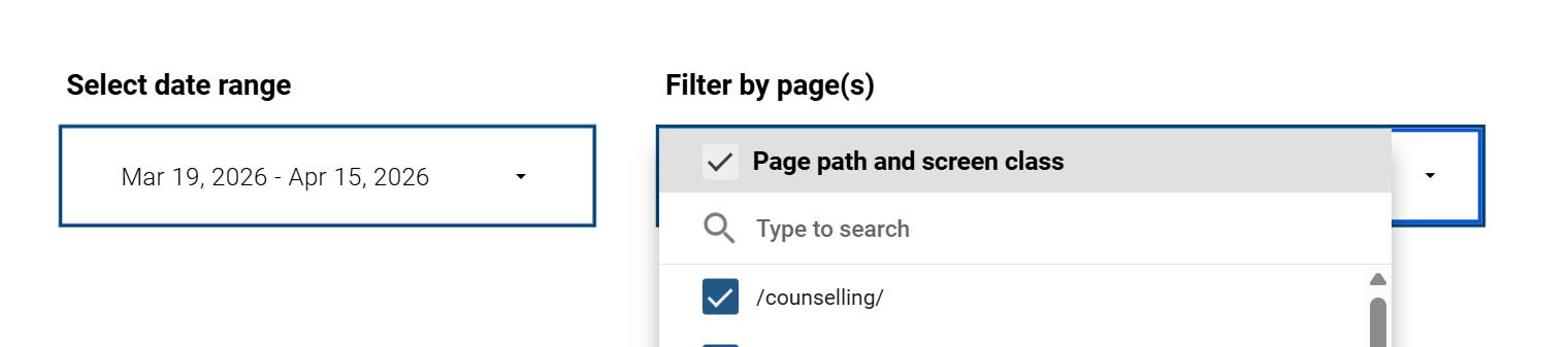
At the top of the dashboard you have two filters:
Date range
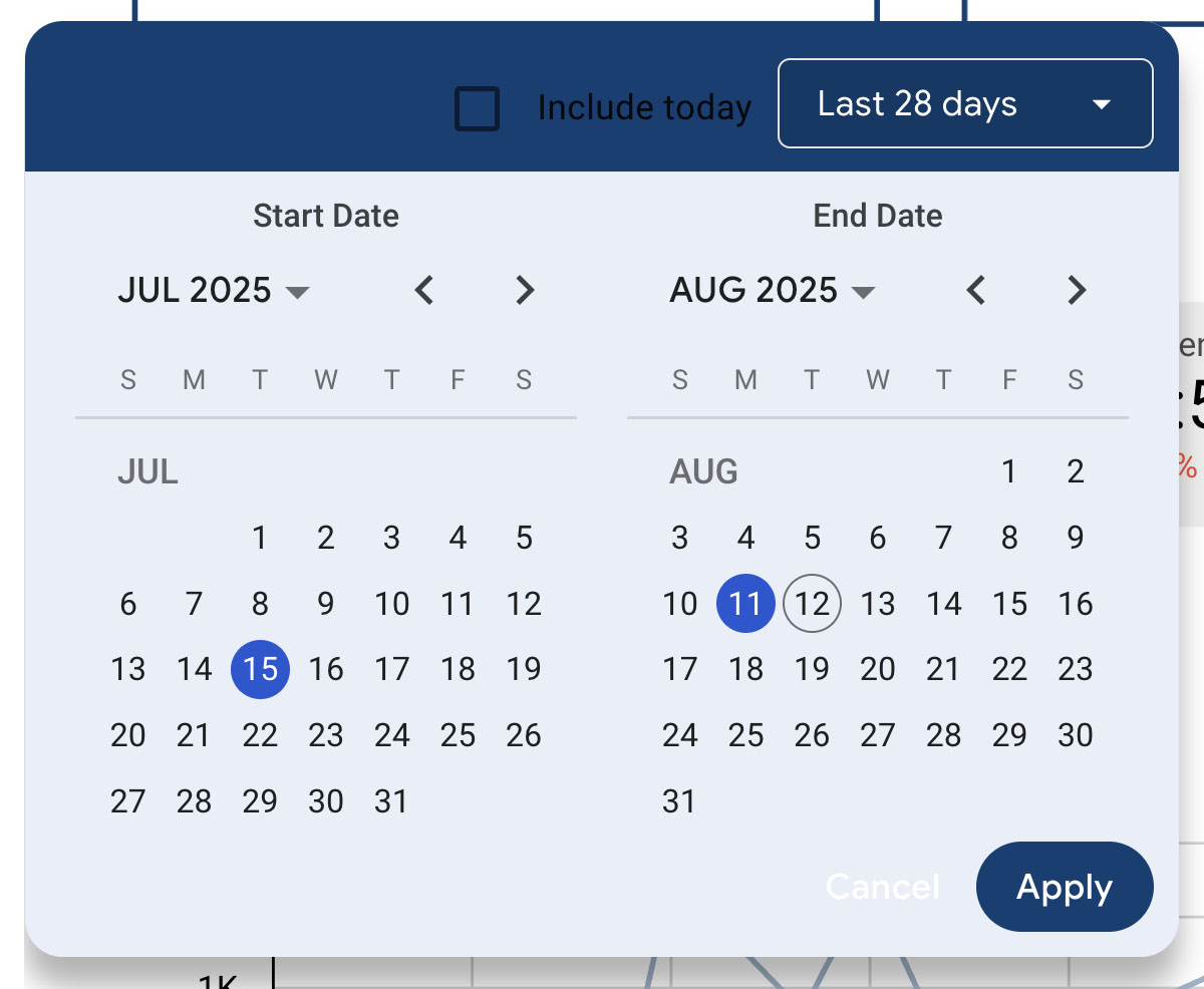
Click on this to select a date range for your report. By default the report will show the last 28 days.
Filter by page(s)
Enter the URL (without https://www.imperial.ac.uk) to filter the report to a particular page e.g. /timetabling/about-us/
Page breakdown
Views
Total number of web pages your users saw. Repeated views of a single page are counted. There is also a total for all the pages at the bottom of the table.
Total users
The total of number of distinct visitors to that page during the selected time period. There is also a total across all pages at the bottom of the table.
Active users
Number of distinct users who visited the page. An active user is any user who has an engaged session. There is also a total for all pages at the bottom of the table.
Views per active user
The average number of views per active user for that page. There is also an overall average for all pages at the bottom of the table.
Avg. Engagement Time per active User
This gives an average of the amount of time each active user spends with that web page in focus on their screen or device. There is also an overall average for all pages at the bottom of the table.
Engagement rate
The percentage of visits where the visitor engaged with the content. This includes:
- Staying on a page for more than 10 seconds
- Viewing at least two pages
- Engaging with content on the page like a video or downloading a document
Traffic sources and devices
Traffic sources
It is always interesting to see how people arrive on your site. As you can see from the chart, most of the traffic to the Imperial website comes from Google search (approx. 60%). When you look at your dashboard, this figure may be higher, but this data also gives you an idea of how your other communication channels are performing e.g. newsletters, social media etc.
Devices
This will tell you what proportion of your visitors use desktops/laptops, tablets or phones to access your website. Looking at the overall average across the website, usually around 60% are using desktop/laptop devices, with 35% using phones and around 5% using tablets.
When making decisions on content and layout, you should consider trends. i.e. if you are seeing a growing number of your visitors are using mobiles, then you should really factor in the mobile user experience when creating your content or deciding on layout. For example, where your call to action buttons go - sidebar content appears at the bottom of the page on a phone and highlight box content appears right at the top.
Search queries
Search data is a really important thing to look at. The majority of traffic to the Imperial website is via search, so understanding which terms or queries people use to access your website is really important for the following reasons:
- It helps you understand the language your visitors use. Trying to incorporate this language into your content will really help to make the content understandable and easy to navigate.
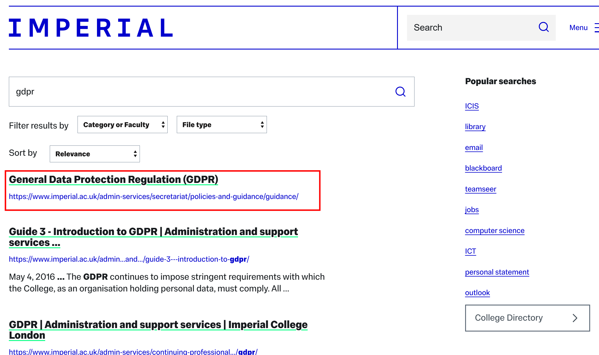
- If there are really common search terms then you can request a promoted search for the internal website search. You can do this by emailing Geoff Day or Adam Piccolo in the Digital team. Once set up, your page will appear at the top for any searches for that term. For example, a search for ‘GDPR’ will show the following promoted search result denoted by a green line.
Other tools for analysing search trends
As well as looking at Imperial search data, it is also worth considering other tools when looking at the words and phrases that people use to describe your subject area. Google Trends is a great resource for this as it looks a wider search trends, not just those pertaining to Imperial. AnswerThePublic is another useful tool for this as it utilises the data from several search engines to give you the most popular search phrases based on a keyword, which is basically a report of the autocomplete searches you get when you start typing a word in Google.
Combining metrics to aid decisions
Trying to determine user engagement
Engagement is something that is always hard to measure, but there are a few metrics that can be combined to give you an indication of user engagement with your content. One of the simplest things to do is to look at the total pageviews and engagement rate and time. If you have a page with a low number of views, a low engagement rate and the average time someone spends on the page is low, then it is likely users are not finding this page useful.
You can strengthen this case further by assessing the readability of your content using tools like Readable or Hemingway which will give you the number of words, readability score and estimated reading time. For example, a page may have these stats:
- There are 1,200 words
- It takes 5 minutes to read the page
- There have been 10 pageviews in the last 6 months
- The average time spent on the page is less than 20 seconds
- The engagement rate is under 20%
This is a fairly extreme example, but you can clearly conclude that engagement with the page is very low - there is quite a lot of content, but very few people are looking at it, and those that are, are not reading it. In this case, the most obvious action is to delete this page, but you could consider other actions such as rewriting or raising the profile of the page in search results and discoverability from the homepage of your website.
Downloading data from your dashboard
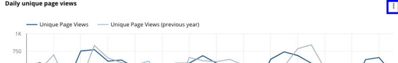
When you navigate your dashboard it is possible to download the data from any of the sections to a CSV, Excel or Google Sheets spreadsheet. To do this move your mouse pointer over the relevant section and click on the 'more' menu button in the top right of the section (represented by three vertical dots). You can then select one of the options. Please note that you will need to be logged into a Google account to be able to export data. If you do not have one already you can set up a Google account login using your Imperial email address.
Quota errors
If you experience a'Quota error' on your dashboard then this is because the data has been accessed too many times within the current hour. Google sets daily and hourly quota limits for the Google Analytics API. This means it is only possible for Imperial to access data on the Imperial website a certain number of times each hour through Looker Studio dashboard reports.
In these cases, please wait for an hour and then access your report again.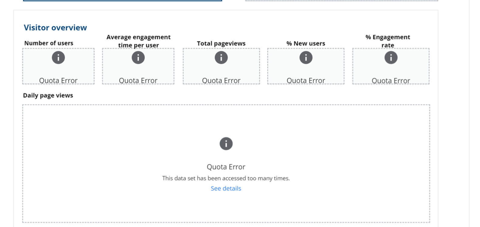
Other useful resources
- Interpreting Google Analytics (Ocreative design)
- Web marketing: How to interpret bounce rates in Google Analytics (dummies.com)
Video - In Analytics, What do the Numbers Really Mean?
Katie Sherwin, Nielsen Norman Group
In Analytics, What do the Numbers Really Mean? Katie Sherwin, Nielsen Norman Group

Need further help?
In the first instance you should get in touch with your Faculty Web Officer (FWO)